LAUNCH · 2024
Clear, easy-to-read packaging for a complex product.
Greenfeed · Baypass Protein
- Client
- Greenfeed
- Category
- Brand
- Solution
- Launch
- Year
- 2024
- Packaging
- Illustration
- Type system
- Color palette
Brief
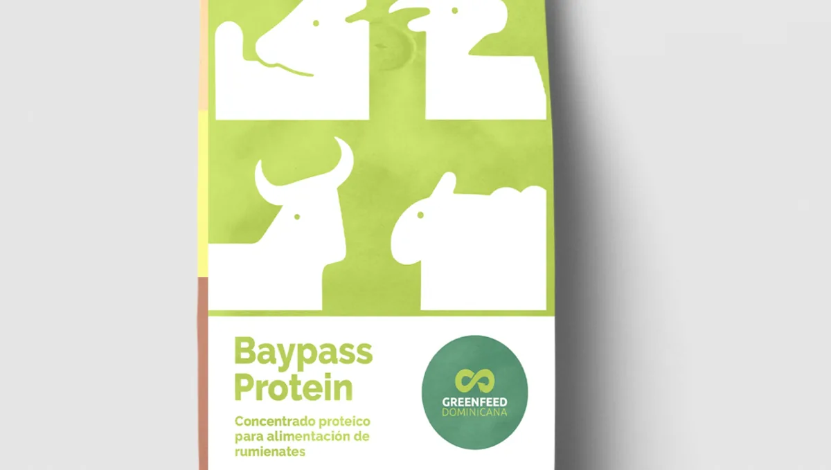
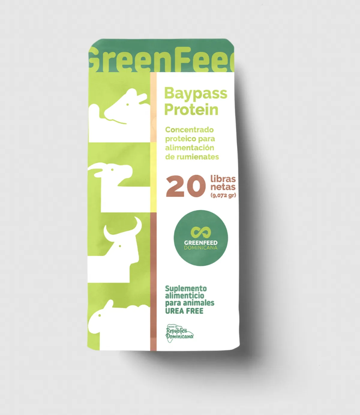
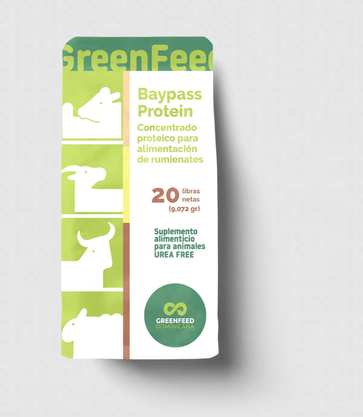
Greenfeed needed the packaging for Baypass Protein, a protein concentrate for animals. It had to speak of nature and give the technical information clearly.
Original illustration and a two-level type system.
- Product
- Baypass Protein
- Format
- 20-pound sack
- Typography
- Noway Round + Ubuntu
Pieces
-
Variant
-
Variant
-
Variant
-
Back


Impact
A special product in a sector where few care about how they look. The result: more trust, more clarity, more sales.
-
Instant recognition
Standing out in a sector that paid no attention to design.
-
+40 points of sale
In its first three months.

Approach
- I
Educational, not childish.
- II
Animal illustrations cut out of the pack’s green.
- III
A rounded typeface for headlines and a sans for the technical data.
- IV
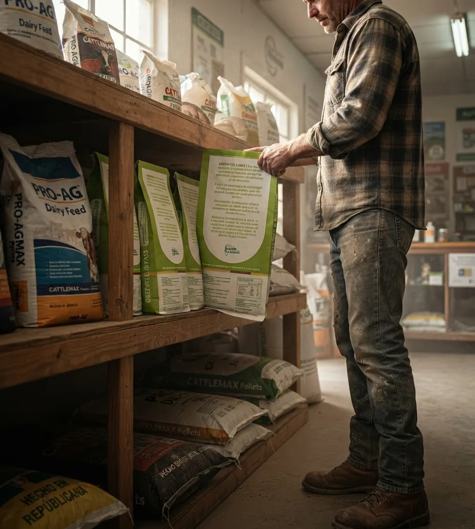
Front to recognize; back to decide.


Result
Baypass Protein stands out in the warehouse and makes sense on the farm.
LAUNCH · 2024
More cases
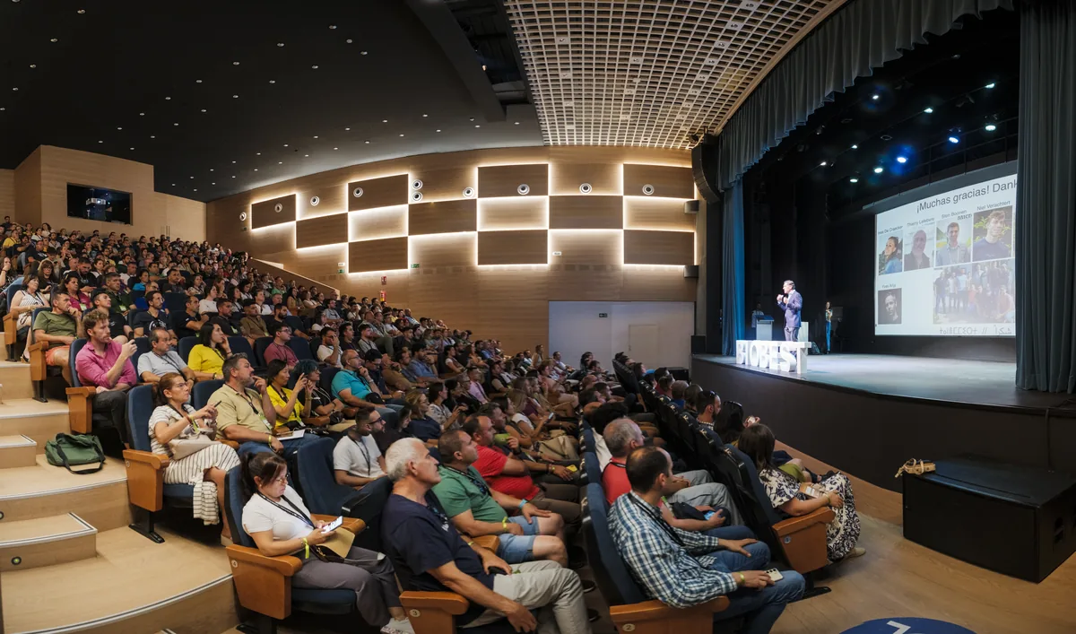
- LAUNCH · 2025 Biobest presented its biological launch as a software update. Biobest · Vespiformis‑System
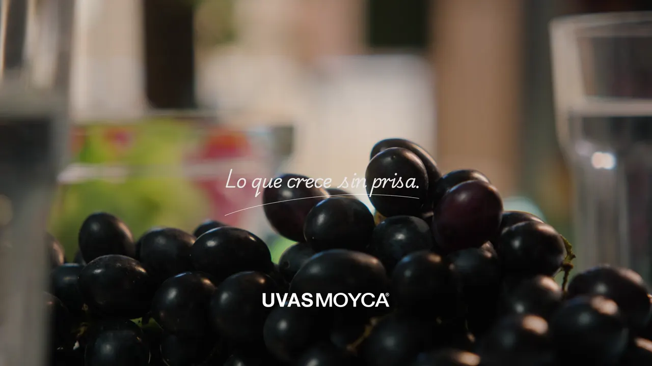
- LAUNCH · 2025 A new, unhurried story for Uvas Moyca. Moyca
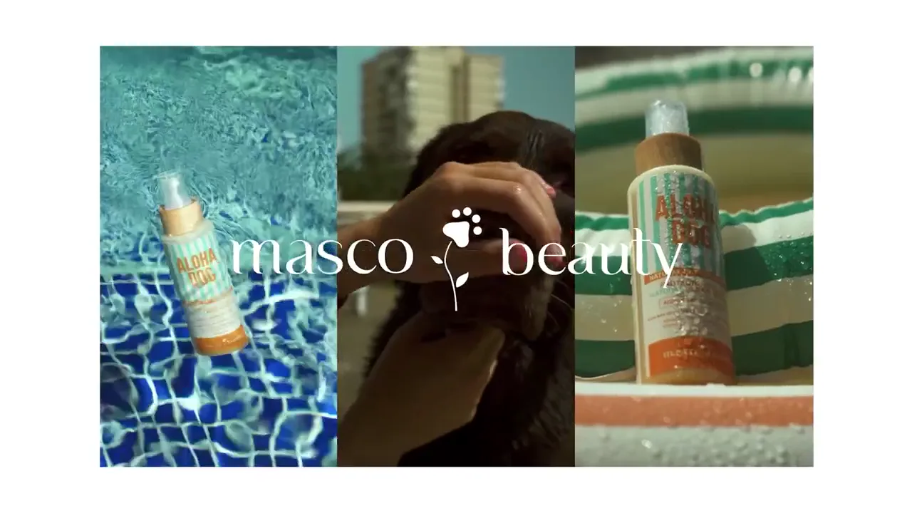
- LAUNCH · 2024 Masco Beauty. Cosmetics for summer-loving dogs. Masco Beauty · Summer campaign
- LAUNCH · 2021 Fundación Mapfre opened the Jawlensky exhibition through his brushstroke. Fundación Mapfre · Jawlensky