REPOSITIONING · 2026
Kunsen. A brand with a thesis: digital health that works.
Kunsen · Rebranding
- Client
- Kunsen
- Category
- Brand
- Solution
- Repositioning
- Year
- 2026
- Strategic findings
- Positioning
- Tagline
- Visual identity
- Brandsheet
- Website
- Event pieces
Brief
Kunsen is an accelerator, a community and a fund all at once: three brands in one. It had to choose one thesis and hang everything else from it.
Repositioning, identity and website for a digital health innovation hub.
- Tagline
- Making digital health work
- Concept
- Structural clarity
- Modules
- Evidence, access and capital
THE EVENT AFTERMOVIE · TWENTY-FOUR SECONDS
Pieces
-
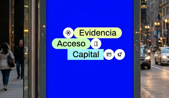
Street poster
-
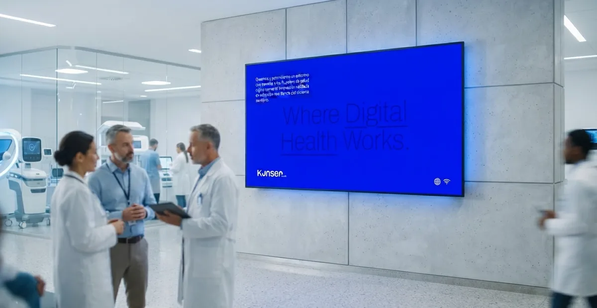
Screen
-
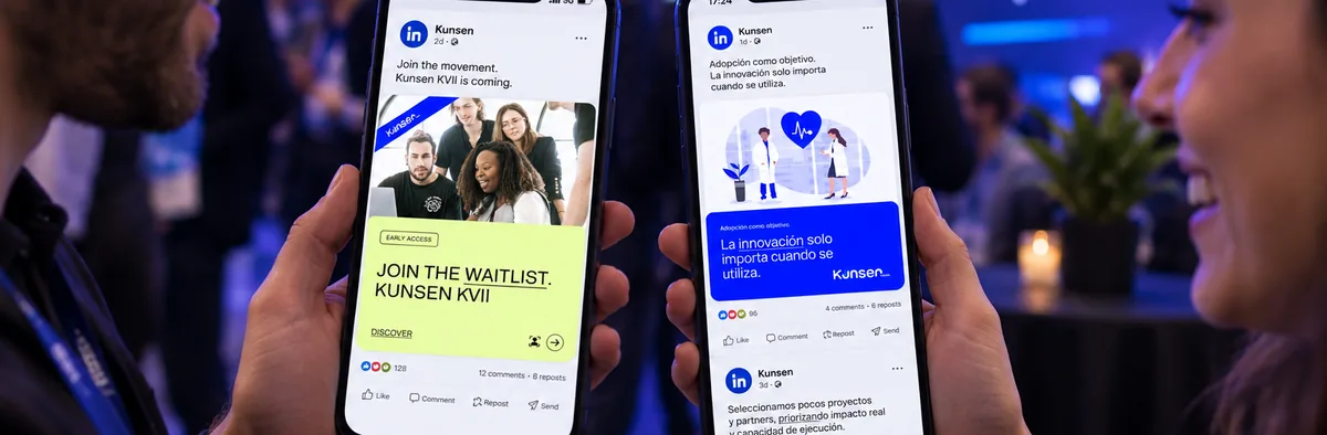
Boxes
-
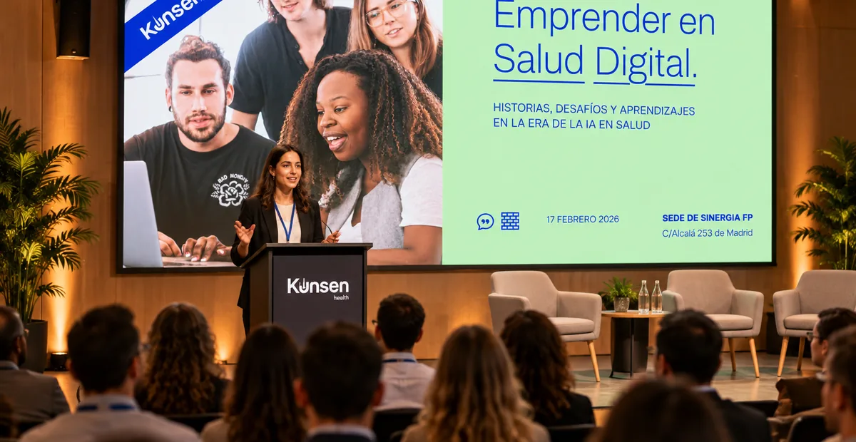
Event
-
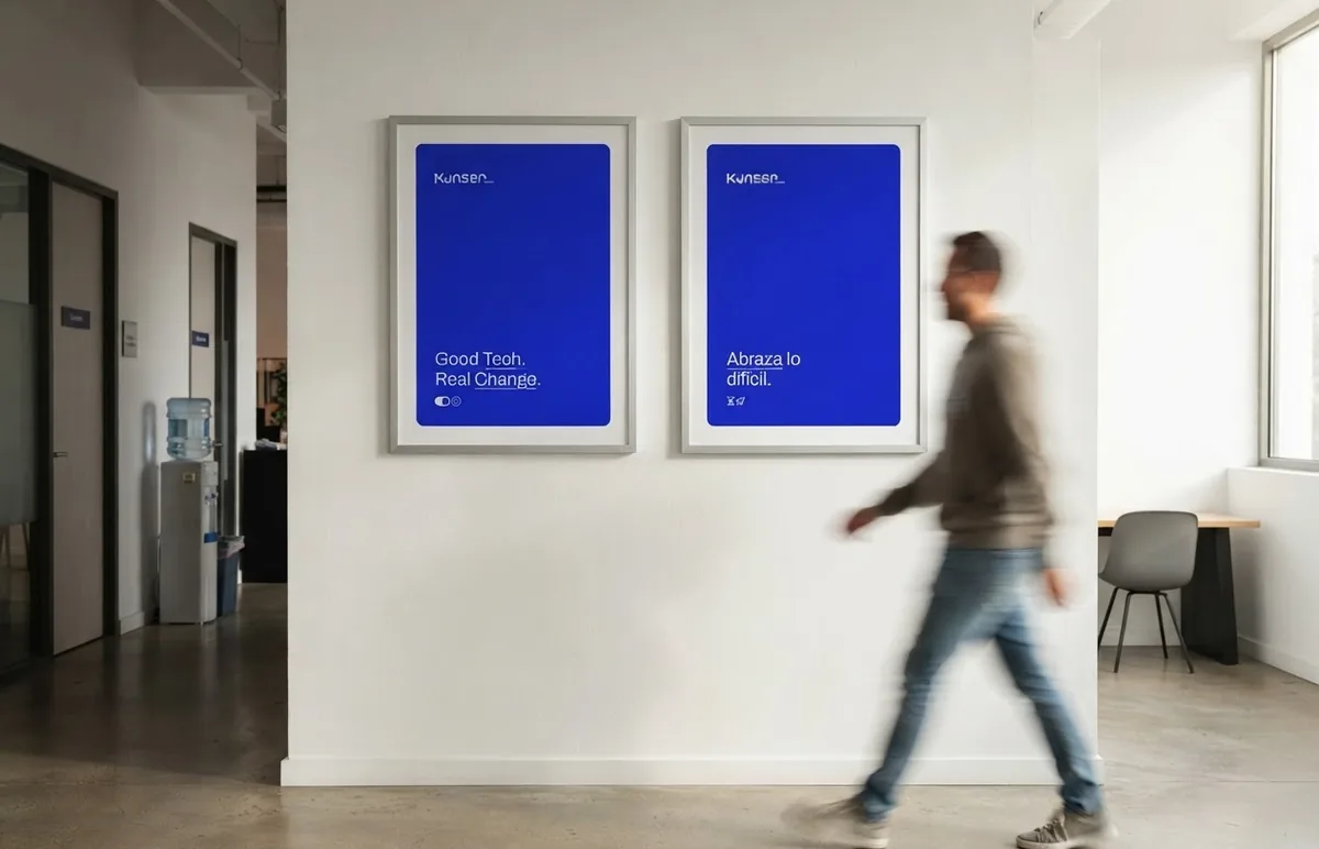
Posters
-
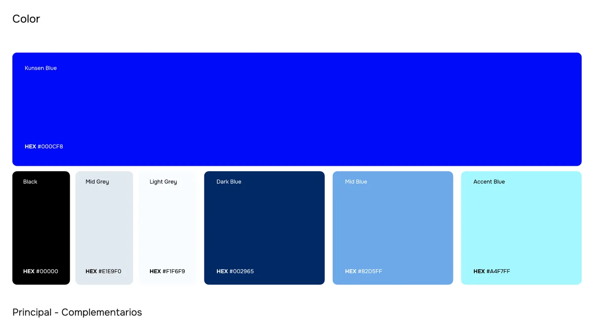
Color
-
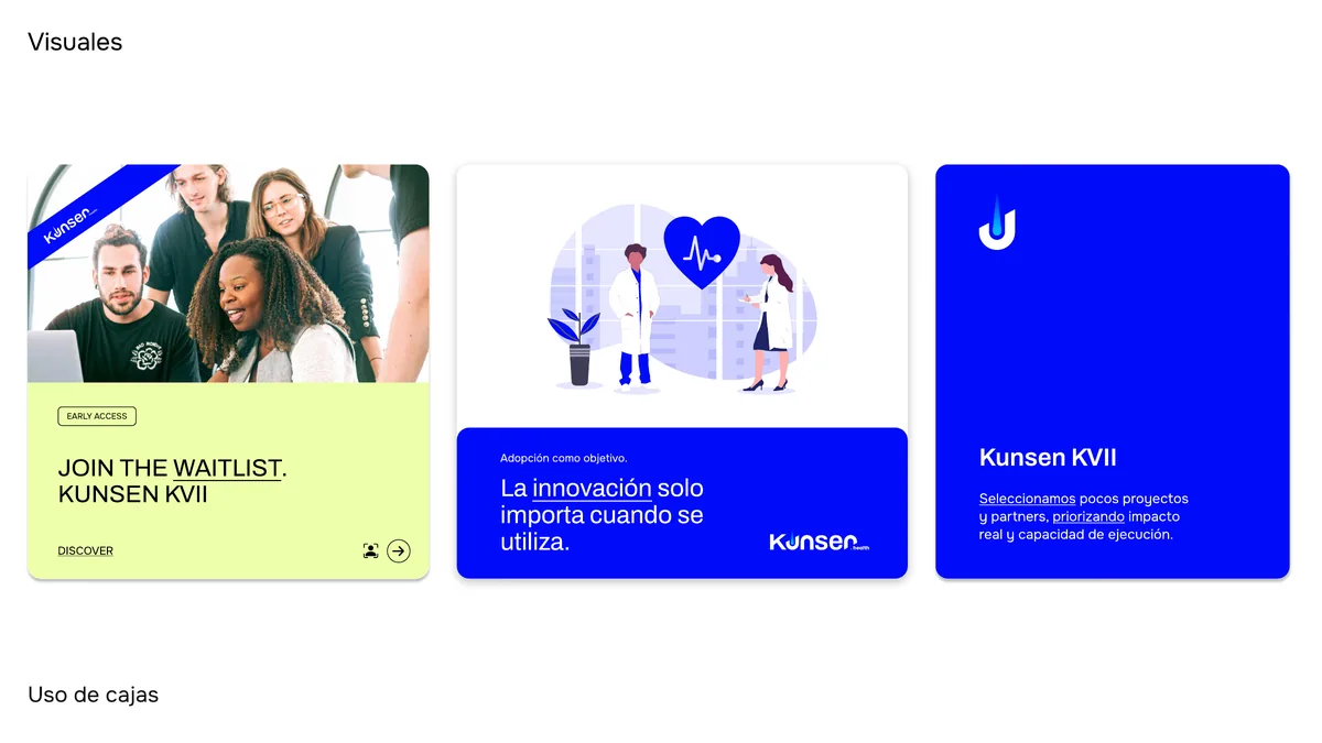
Box system


Impact
Kunsen explains itself in three words: evidence, access and capital.
-
3
operating modules in a single flow built for adoption

Approach
- I
If a piece doesn’t reduce complexity, it isn’t Kunsen.
- II
Modular blocks, hard alignments and a hierarchy you can scan.
- III
An electric blue to decide; functional pastels to organize.
- IV
Cases instead of services: the evidence is the content.


Result
Kunsen has one thesis and a brand that organizes it.
REPOSITIONING · 2026
Solution for this case
Repositioning
What you do has changed. Let your brand say so.
More cases
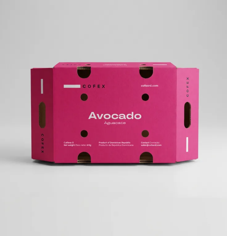
- REPOSITIONING · 2026 Cofex turned tropical fruit into precision. Cofex · Identity and applications
- BRAND ARCHITECTURE · 2024 Four businesses under one fold. BackInvest · Brand architecture
- BRAND CREATION · 2025 A premium approach to compete with importers. Altura Foods · Brand and packaging

- BRAND CREATION Pasta Negri. Symbols drawn from its essence. Pasta Negri · Brand, packaging and website